Thursday 24 November 2011

Web Research

Web Design Research

Ok, so I started out my research of what I would ideally want on my website by looking at my favourite artists’ online presence and analysed what worked for me on their sites, (I guess that this is all personal opinion, so no offence is meant by any of my analysis!)

Ale Diaz is a firm favourite so I started out there…I really like her URL to start with (http://www.alediaz.com/), it’s easy to find and relates to her and her name well. I too like the use of her own typography, it gives it personality and accessibility too, anyone can create some quick typeface of their own, right? Whatever the final outcome of my website I would like for people to be able to engage with it and for it not to be overly precious and finalised; I would like the rawness which is incorporated in my work naturally to come through. I like a plain white background, it’s easy clean and makes work stand out, there’s no distractions other than what people should ideally be there to look at in the first place – Ale demonstrates this well. Important information such as email and contact details need to be on the main page so that potential clients and people wanting to commission me can find them easily. I don’t want them getting annoyed trying to find my details and eventually giving up on me!

Although flashy animations look good such as those used on Tim Burton’s site (http://www.timburton.com/) I can imagine that they would get very tiring very quickly. I don’t want people getting bored waiting to see my actual work or contact details whilst waiting for something that isn’t really an important feature just a filler. I believe that a website is there for a purpose and I want it to achieve that purpose quickly and efficiently. Interactive features and music, as again seen on the Tim Burton site, are a lovely addition first time around, but if a client is making frequent visits to my site I imagine these would get rather boring too.

Sara Fanelli (http://www.sarafanelli.com/) also makes it too complicated getting to the point with the click on this click on that palaver. To see any of her actual work (including clicking the link from a Google search) you need to make four individual clicks to see one piece of her work, more clicks if you need to see more than one as each piece is individually listed. I think having all the pieces on a full screen shot will allow ease of viewing and less boredom searching around. Additionally, it eradicates the simultaneous new window boxes appearing every time you click on another piece of work you want to view, which is also highly irritating.

Eric Carle’s website (http://www.eric-carle.com/home.html) is user friendly, straight to the point and most importantly engages his target audience – children. If my target audience is definitely going to be children (I’m producing rather a lot of children’s story book work) I need to bear this in mind too. Icons that are child friendly are going to stand me in good stead compared to words which children may not know or understand wholly. His font is easily readable making it accessible for all audiences and everything is labelled well. It is nice to know that I agree with Eric Carle and Quentin Blake (http://www.quentinblake.com/(amongst others)) that keeping a neutral white background will make emphasis on my work without added distractions. Unlike these two very well established illustrators who must receive thousands of junk mails etc. I need to have my contact details displayed well. Quentin Blake for example only lists his agents’ details; unfortunately I don’t have this luxury just yet (hopefully one day though!)


Attributes for my site:

So then, attributes I would like my site to have are:

1. A synonymous URL

2. Plain, clean, white background

3. Contact details on the front page

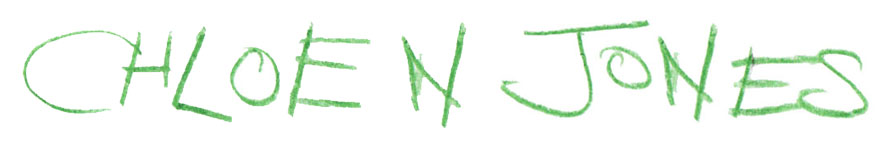
4. Hand rendered typeface

5. Child friendly icons

Illustration's Digital Future

Illustration’s digital future

I have always had a pc and I have always professed to be a Mac hater, but then something within me changed, in 2009 I started an illustration degree…

In February of this year (18 months after my start date) I required a new machine, my old HP sadly passed away and I proceeded to purchase a brand spanking new Sony Vaio to replace it, oh how I regret that decision. Please don’t misunderstand me it’s not that the Sony isn’t adorable and so pretty to look at and actually a very good machine in its own right, it’s just after working on a Mac day in day out at university I am falling in love with something that just makes my life so much easier. After eighteen months of working with them already, I’m still not sure what possessed me to buy another pc, either way the huge mistake is of my own making.

The editorial I found in September’s (2011) edition of Creative Review resonates so much with my situation, it talks about ‘following the advent of the Mac, almost every aspect of the production of visual communications was changed forever.’ Of course, during the 1990’s, my need for a Mac (or any machine for that matter) was none existent, I was probably still in nappies! It is difficult to imagine how life for an illustrator was before the Mac; the work must have been painstaking. People are talking about illustrations digital future, for the most part, as though it’s in crisis, where illustrators will not be able to feed their families because of the techno evolving society that no longer requires our work. Sure some technology does ignore our work, for example the Amazon Kindle and to some extent the iPad but our work is required in other fields then, such as the advertising and the marketing of such a product.

The issue then is that, sadly, Steve Jobs is no longer with us and he was that one guy who ‘understood the value of what we do. He got it. And he got us.’ Will the world of illustration be able to survive now he’s gone? Will the technology we so regularly use and abuse be able to keep up with us without the legend that made the transaction so smooth? There are many facilities available to us now that make our life so much easier and our work so much more accessible than ever before, take the iPad for example (another of his creations) to some extent our work will not be required with this invention, but it also makes it so much more accessible, and global. People can now view our work from any continent, without us having to mail it there! I know I may sound a hypocrite for my previous ill-judge of Mac, but now is the time to embrace this technology that has and still is changing our world; it is what enables us to be able to now ‘think different’.

Portfolio Visit 3

Thursday 24th November

10am appointment with Lise Brien @ The Chase

Manchester

This visit was the one that I felt most comfortable with out of the three, not necessarily because it was the last of the three, but because I have been to The Chase before. I spent a week working there over the summer on a work experience placement and I have been in regular contact with Lise since and find her very approachable with any queries I may have.

The pre-nerves then weren't so prominent although they were still there to a certain degree. Lise always seems to comment on my appearance which gives me confidence in how I present myself at least (my work presentation however, could probably do with much more work!) Unlike my other portfolio visits, Lise conducted hers in the reception area, which also made me feel more at ease as it seemed very informal and much more friendly, almost like we were on the same level, she came down to me. Whether this was a technique she uses for ‘newbies’ or how she would conduct a professional portfolio visit I’m still unsure. Either way I would like to think that she treat me as she would a professional illustrator.

The actual presenting of my portfolio is what I find most difficult, not because I’m not confident in the work I’ve included in it but because I’m not confident in talking about my own work, I’m my own worst critic. I suppose nobody else can know my work better than me and I do need to talk about my ideas and how I produced the pieces etc, I still just find it an awfully excruciating process, most probably because I know I am being judged. After presenting my limited portfolio to her she supplied me with her comments. I know by this point I need more work in there, preferable 20 pages and currently it stands at only 8 strong pieces. As she represents a design agency and not illustration she could only really provide me with how she would view an illustrator’s portfolio, which is understandable. The first six pages are illustrations I created for the Helping Uganda Schools project and although she thought they were very nice and child friendly they are not something that she could base a possible commission on. Unless a design agency is looking to commission specifically for a child audience (which is very rare) these are not something that she personally would be overly interested in. This point was useful because I realised that I could and should be rearranging my portfolio every time I make a visit because not all agencies etc. are the same and are in fact looking for different things. For example if I were going for a portfolio visit to a publishing company my children’s book illustrations would need to be at the front however when visiting a design agency my more graphical elements need to be at the front with the children’s book images more to the back.

My James and the Giant Peach characters designs were much more attractive to Lise. These incorporate collage and stitch and to her are much more usable in her line of work. She commented on their representativeness and quirkiness and appeal much more to a designers use and on how I was very specific with my collage materials making them much more robust. It would be worth exploring the individual elements more to see if I could make them even more refined. The simplicity and graphical quality allows more flexibility in the design market. There is a hint of realism but the surrealism gives them more caricature. They are a much more elegant solution and are more distinctive than the former book images. She went on to say how she could visualise a train of insects produced in a similar manner branching out into flowers too and the stitched lines representing water, ground and skies. These images have much more potential to work on different levels, although they would work for children too. She made me realise that children at age 3-5 can also interpret quite sophisticated visual language too, it doesn’t always have to be so literal.

To sum up, I think Lise was very interested in my work because she has children of her own. If for example I were to attend a portfolio appointment where a designer in particular doesn’t have children maybe children’s book illustrations would not be the most ideal work to present. Lise’s comments on the James and the Giant Peach characters is commendable as I really enjoyed making these characters and they were much quicker to produce than some of the more laborious children’s book images. Suprisingly, Lise asked me to contact her again in 6 months to show her how I am progressing so that she too can review my work, fingers crossed it may turn into something more J


Lord Whitney

November 21st

Lord Whitney Talk

Lecture Theatre B. Stockport College

Lord Whitney is a two piece collaboration act comprising of two female creative’s, graphic art and design ex-graduates from Leeds. They are labelled as art directors but consider themselves as more 3D illustrators. Their undergraduate course covered a broad spectrum of art specialism’s including photography, typography and illustration. Amy preferred the photographic route whereas Bex was more of an illustration geek. Both are hands on and are heavily influenced by literature and theatre, in particular things that make them laugh, Spike Milligan and Dali and both favourites.

Their talk was an informal explanation of their journey from leaving university to where there are in the creative industry currently. They spoke of the importance to keep on working after uni and keeping in contact with creative friends and peers. This is especially so because the once shared studio will be missed and the support network of tutors and peers. I can personally imagine the loneliness of the situation leaving university and not sharing that with somebody else. At least if I have somebody to moan to every now and again, even if it is only in the pub, it gives you the reassurance that you are not alone in that situation.

For the first year or so after uni, the girls were temping, with jobs moving in quick succession. Both however didn't feel happy in the work they were doing and they finally decided to collaborate properly because they mutually felt that there was no job out there to meet their specific needs and requirements. Originally, they started making business cards to make the idea seem like the reality, these were from scraps of paper and cheaply produced as a lack of funds made it difficult to get them produced to a high standard. However on the plus side these cards will have been much more authentic than the mass produced numbers from firms such as Moo etc. I have just sent off for my free pack of 10 featuring a couple of my own designs but they lack the uniqueness that the cards Lord Whitney no doubt were crafting.

It was endearing to listen to their financial struggles when first setting up their business because it not only shows that it can be done, but you're not the only on in that boat, there are lots of people out there who struggle at first. Logically, because they had a lack of funds for their projects their work was not too precious or overly thought, they had a rough raw feel which makes it much more accessible. Apart from this accessibility it also makes it much more personal and engaging to a student audience particularly.

The setting up of this business made them realise just how much they loved doing what they do. They look at other outlets to broaden their market and client base and currently look at events too and have found that their skills can be applied in all different arenas. A recent event they were asked to collaborate on was The House of Fairy Tales where they made environments for people to become a part of.

They acquired a lot of voluntary work experience to get their name out there and to show what they can do, but the advice was not to do anything for free more than once. If a company asks you back they obviously like your work so to ask you to come back they can afford to pay you.

Also, they have noticed that undergraduates currently spend weeks researching projects and ideas rather than jumping in at the deep end and producing work straight away. They wanted to show that work can be produced really quickly and it doesn't have to take weeks and weeks. They have set the group a week long project to show how quick work can be produced if you apply yourself efficiently.

For them, finding a studio was the kick they needed to properly start working and it provides them a base for more work and commissions to come in. Blogging, Tweeting and using Facebook generates interest from potential clients and they update each constantly to keep interest and their image fresh. To keep money rolling in whilst they are still working on getting their business up and running, they do event styling and window dressing, though it is clear that their creative flair and passion is in their own business.

Finally, inspiration doesn't have to necessarily come from art, look at things around you, things that interest you, your hobbies and passions outside of the art world. It could be a toy shop or things that you love.

What I have gained from this talk is to stay true to myself. If I don't enjoy a particular brief then I need to take from it what is important and make it my own. When Amy and Bex came round our studio afterwards, they commented on my work for its colour. This is something that has been a subject of much criticism lately especially from tutors, however they think that it is this vital element that makes my work mine. I now need to find a vehicle to apply this to any brief that I am issued. It is the colour that could give me the consistency to my portfolio that I have felt it has been lacking previously.

Tuesday 22 November 2011

Carson Ellis

At Pete’s recommendation I decided to research Carson Ellis. Carson was born in 1975 in Vancouver, Canada. She illustrates both album covers and children's story books. The 'stripped back' use of colour Pete was talking about is quite prevalent (see images above). It is good to have some idea of what ‘stripped back’ is supposed to mean and what it looks like in practice, but it doesn’t look like anything I would produce.

From what I can see from her website, she also gives back to society by holding free art classes to teenagers every autumn. Not only does this give her something additional to put on her cv (not that she needs it anymore!) but it gives her the exposure that every illustrator requires to keep generating work.

I understand from my portfolio visits thus far that it is of very limited work, it is by no means expansive and it needs to be by the time May comes. Additionally, it doesn't boast the range of skills I have to offer. I am most comfortable illustrating children's story books, they allow my imagination to run off with itself, but to appeal to the widest possible market I need to include different types of brief. Craig Oldham from Music in particular pointed out that he wouldn't feel confident commissioning me for a package brief for example because my portfolio doesn't show him that I am able to tackle that type of a brief.

So, for the latest brief dealing with a live competition, I have decided to undertake the challenge of designing a magazine cover for Little White Lies. I think that this will give me scope to develop my skills further and show potential clients that I possess the ability to undertake different kinds of briefs. With this brief I intend to consider the colour as part of the overall image and not think of it as an afterthought, the type too needs to be considered because if I could integrate it into the image rather than putting it on top as a separate layer it would look much more aesthetically pleasing. The middle and right image above by Ellis look like they have type integrated into the image making it look much better than the image on the left for example.

Peter Adlington Contact

Here is a response from Pete Adlington, ex Stockport graduate currently working in Edinburgh.

I wanted to ask him specifically for feedback on my use of colour as it has cropped up a few times in tutorials

as not being as controlled as it could be.

mail@peter​adlington.c​o.uk

Add to contacts

To Chloe Jones

Hi Chloe,

Thanks for getting in touch and sending me your stuff, it looks great.

Nice to see someone who uses paints still, can I take it that you've resisted the computer and will continue to do so?

You say that you're having trouble with your colour, I wouldn't say it was all over the place at all, but whatever the medium, be it acrylic or pencil, you are always at its mercy with the colour. The strongest colour-wise is the fish, which is purely because it's a limited palette and that's something which will hold you in good stead throughout your work. Limiting yourself to only a few colours forces restraint and that is absolutely essential when dealing with wet media. There's no CMD-Z with a paint brush obviously.

We've just published a kids book called Wildwood and the illustrator for that (Carson Ellis) uses a really beautiful colour palette which is well considered and stripped back. I understand that her target audience may be a bit older than yours for these pieces but I can promise you that if you tried using a more muted palette with colours that are complimetary then your work will be transformed. Also check out Nobrow magazine for amazing colour palettes.

As to other advice, I guess it would have to be to do as much work as possible. You obviously have a talent in traditional art skills, and a playful sense of imagination so embrace it. Also, explore other ways of working, I'm not saying jump on a computer, I'm saying follow the route of hand making your illustrations. I remember a girl called Nina in my year who found a love of lino print and made some unbelievable stuff that came about purely from play and experimentation. I bet you've you're really comfortable using paints, but what have you got to lose by trying something else?

I'd love to see how your work develops over the coming year, make sure you keep in touch and get in contact about anything to do with a brief that's bothering you. I agreed with Ian that I'd be here should you guys need me and I will be.

Cheers,

~P

Pete is clearly a fan of the wet media and I am glad that somebody recognises my determination to stay away from digital media.

I agree with his comment on my fish being the strongest element in my portfolio so far. For me this image is strongest because of its consistent use of colour and its symmetrical structure. Moving forward with my painting it is becoming clear that I need to limit myself to a palette and be disciplined not to waver from it. I will certainly be researching Carson in future posts in a bid to aid my personal development. Ben Jones my allotted graphic guru mentioned NoBrow as a point of contact for potential portfolio visits, I have contacted them before maybe I ought to take another look at their site this time with another purpose in mind.

I am completely open to the comment about playing with other media, however, I feel that I am starting to form a consistent pattern in my work and I’m not sure if I want to disturb that progress just yet, maybe after the Christmas break this is something to have a go at. I will definitely be making use of Pete as a contact again his feedback was very encouraging and the critical comments were constructive in a way I can move my work forward.

PS. I added the smiley face from his website Bio myself, I think he's quite cute!

Wednesday 16 November 2011

Portfolio Visit 2

Wednesday 16th November

10am appointment with Craig Oldham @ Music

Manchester

My second portfolio visit was to Music on Silk Street, Manchester - a rather posher area of town, and away from the distractions of spending money - always a plus!

My appointment was with Craig (the guy who came and did the lecture a few weeks ago) so I wasn't feeling altogether the same nerves as I did on my first visit. Or maybe it was that I am becoming more confident with my work and in presenting myself? Either way, not knowing Manchester all that well, I certainly still did have nerves about finding the place especially with it being so far off the beaten track (and I thought Taylor O'Brien was difficult to find!)

He invited me into the 'bubble' - a meeting room with glass walls on two sides making me feel actually very exposed, a good job I sat with my back to the rest of the office. He had no shoes on I noticed, he made me feel at home straight away.

I still need to find a presenting method that suits me better; I still don't know when the appropriate moment is to start showing my work after all the pleasantries etc. Any pointers anyone? I don't want people waiting for me to start and at the same time don't want them thinking me rude by cutting their conversation off.

Craig explained that 80% of the time a portfolio visit is for an agency etc to assess you as a person and not necessarily the work. Usually you would have sent work through ahead of the visit as a taster of what you are about and essentially this is the work that a designer or agency base their appointments on. The visit is to vet you, to make sure your character would fit within the company and that you possess all the qualities they require, and then of course an expansion of your work which they will have already seen some of.

I explained to Craig my working method where I stay away from the computers because the work appears quite flat - I don't like that quality in my work. His comments were that he respected that and the majority of the work that our year is churning out is quite vector and illustrator based. But by stuffing so much detail and information into my images they are becoming more flat than if I had just kept it that bit more plain. Patterns would be a good example to use, they don’t overload the image but they add some information. He particularly liked page 4 of my portfolio because it was the one page where I am experimenting with ideas (see the crocodile peeking through the grass) and technique (the yellow cultured pattern on the red background and wash backgrounds behind the vignettes; it has more texture and is therefore more interesting). This is something which Craig thinks could definitely be developed. I need a connecting thread to link my images together, the Uganda Christmas story book for example lacks this ‘connector’, and pattern would be a great way of introducing this. From this, I can take away that I need to look at my production method more – how can I develop it and which elements really work, alongside adding more pattern where appropriate yet keeping it playful.

There is an apparent ‘nice contrast between figurative and abstract’ in my Uganda images. Craig also likes the tactility of the characters I have produced so far. However, when someone is looking to commission an illustrator, they need to have faith that you can fit their bill. Craig explained that because all of the work in my portfolio is aimed at children, and children’s book illustration a design agency such as his would have difficulty visioning me doing a package job for the new Mac. I need to be able to show my versatility in my portfolio too, he suggests trying a project which is more macabre and dark. University should be the time to be taking risks and experimenting and making full use of the facilities available to me because in the ‘real world’ the deadlines and demands are too tight to be ‘arsing’ around. It’s ironic he should say that, for the next brief this semester we have to choose a competition brief, and I was going to choose the Brother’s Grimm Fairy Tales competition launched by Puffin, maybe the Penguin competition aimed at an adult audience would be a better bet. Something dark and macabre would definitely show this ‘versatility’ quality in me better.

A portfolio should reflect my interests and my hobbies and who I am as a person, not just someone who’s jumped through the hoops to produce one for the sake of having one. Therefore I should be entering competitions and making my own briefs to produce work that I am enjoying and having fun with to be able to show in my portfolio.

In all, my portfolio is too child heavy. It needs more variation to show my skills and flexibility.

Tuesday 15 November 2011

Alice in Wonderland Exhibition, Tate Liverpool


Alice in Wonderland Exhibition 14/11/2011

The Alice in Wonderland exhibition currently showing at the Tate gallery in Liverpool opened on 4th November and is due to run until 29th January 2012 and is described by the Tate as the ‘first comprehensive exploration of the stories’ influence on the visual arts. His stories are rich in logical, philosophical and linguistic puzzles – reflecting their author’s fascination with language and with questions of meaning’.

I arrived with certain expectations from this particular exhibition with it featuring works based on one of the world’s most well loved childhood stories, a 10% student discount certainly impressed me! (and that was on top of the already reduced price for concessions!)

It started out on the ground floor then led up to the 4th (the elevator saved my little tootsies J), behind the curtain however my excitement soon became frustration. To the right were some photographs printed onto canvas by Annelies Strba and to the left a neon light typography installation by Jason Rhoades created in 2004, words illuminated included ‘Brazilian caterpillar’, ‘beef curtain, ‘trout basket’ and ‘serpent socket’. The layout here was rather sparse, completely not reflective of the zaney, out-there story it was meant to be representing. The canvases hung on bare walls although the brightness of the neon light installation did brighten the atmosphere it was only briefly.

Up on the fourth floor there was much more information to sift through, a tiny breakthrough at least. Although as I walked around I did begin to notice that the information was more on Lewis Carol, formally know as Charles L Dodgson and his life, than Alice in Wonderland itself. There were various photographs taken by Carol during his lifetime (he was a keen photographer) ‘the Victorians prized childhood as a symbol of innocence, and children were often the subjects of his photographs’ and some of the layouts he planned for his story, ‘he planned the book in meticulous detail, even down to the placement of the illustrations, for which he made his own sketches.’ The placement of my text in comparison is usually an after thought, so I can make some personal links to some of the work featured and learn some lessons from it.

‘Copyright on Alice’s Adventures in Wonderland expired and it entered the public realm in 1907 with at least fourteen new illustrated editions on sale by the autumn’. Illustrations by Tove Jansson, Maria L Kirk and Adrienne Segur all caught my attention. Sir John Tenniel’s pencil on paper illustrations fascinated me due to their tiny scale and intricate details captured in such a small space, his sense of space and proportion is exceptional. Also, I could learn a lesson or two from Andrei Martynov who illustrated said story with a very limited palette, my palettes have been way too inclusive of recent months featuring a collection of bright colours and more muted shades which don’t always work in unison. Charles Francis Annesley Voysey 1920 created a furnishing fabric showing that Alice in Wonderland was adaptable to many different media; other ranges included ceramics and children’s toy lines.

Later in the exhibition Adrian Piper’s LSD paintings feature as does a porn referenced wall of type, I understand the inclusion of drug related artwork – Alice in Wonderland does hint at drug use when she drinks potions to make her grow and shrink and during the 1960’s drug culture was all the rage. But the inclusion of pornographic related images doesn’t make any logical sense to me, after all Alice in Wonderland is supposed to be a children’s story book, is it not? The neon light installation downstairs also references this porn theme with the words that are illuminated. The exhibition is clearly aimed at an adult audience and not children (though there are warnings where pornographic references are made) due to the formal layout but I am still struggling to find the connection.

Salvador Dali featured towards the end of the display with the inclusion of his illustrations and a short animation on which he collaborated with Walt Disney titled Destino, 1946. Dali later goes on to explain that the girl in the animation is Alice from the Alice in Wonderland story where she is concerned and totally consumed by time. He injects some colour and life into the exhibition space, something that the three of us were desperately searching for, and although we found it, it was only in a very small dose. Dali is playful with the subject matter but still in a surrealist manner.

The layout of the exhibition was disappointing as the subject matter holds such potential for a fun, tactile and engaging environment. I imagined more installations, pointers to the Mad Hatter’s tea party and a dark tunnel to reference the rabbit hole. It was not reflective of the story it is meant to be representing. Instead what we discovered was a very formal, very quiet on the verge of very boring exhibition that could be found in any other gallery, it was standard but nothing more.

Wednesday 9 November 2011

Hopes, Fears and Opportunities Part 1

Hopes, Fears and Opportunities Part 1

I have many hopes and fears in my life; some are bigger, bolder and brasher than others. I fear graduating and still not knowing how to work the tumble dryer (I’ve mastered the washing machine at least!) I hope I will still be fully functional after all the deadlines I will have had to meet come July and I will then, finally, get the opportunity to sleep… for a short while at least. University work itself brings a fresh wave of these hope, fears and opportunities.

When I first embarked on my journey through my illustration degree I wanted to graduate with a first class honours degree, I hoped that I was going to be good enough to achieve that. But this year has taught me more than anything, that a first class honours degree doesn’t mean anything if I don’t have fun. All I can do is my best, if I can truly say, hand on heart that I worked my socks off, to my hardest and fullest potential; surely no-one can ask any more of me than that? …not even myself.

I fear that graduating without a first class honours degree I won’t be able to forgive myself for not working my hardest or to my fullest potential and thinking with hindsight, could I have worked that bit harder? Could I have stayed up that bit later? Therefore, I need to make the most of this opportunity before it’s too late, to knuckle down and be relentless, to give my all to this course and to truly say I did my best. After all, what is the point of all this labour if I’m not going to commit 100%? If that’s going to be the case I may as well just resign now...

I hope that one day I will illustrate a children’s book and it will be on display for all to see, to impact somehow on a child’s learning. I fear that I won’t live up to my own expectations; I need to make opportunities so that I can fulfil these hopes.

At the beginning of this semester I filled out a sheet based on my hopes, fears, opportunities and aims. My hopes were to produce more work, last year I produced very little and as a result I now don’t have as much portfolio pieces as I’d like. I wanted to secure a first class honours degree, a PGCE place at Sheffield Hallam University and to win the Uganda competition brief. To make these hopes a reality I had to put in place a structure that would help me to realise them. My first hope, producing more work was relatively simple, I would get my head down and start producing work, if it wasn’t appropriate for the brief that was fine, it’s a learning curve and needs documenting to show my progress. If it helped, I would produce a timetable so I could see what I should be doing each day in order to make the most of my limited time. Last year I was too involved in the finished outcome rather than letting my mind and brush wander to places it could have. My first class honours degree will come if I keep being relentless and putting the hours in. But focusing on the mark or grade will not do any good, I just need to know that I have done my best and done all I can to ensure that it is my best and a development on the previous project. I have sent my GTTR application with Sheffield Hallam as my preferred choice for a primary school position. I spent as long as I could on my personal statement, editing, and the outcome of that will be seen shortly. I will prepare for interview anyway in a hope of securing a place.

My fears were that I won’t be able to cope with the workload and that there would not be enough time. Sure enough the deadlines seem to come around all too quickly for my liking. At one point I wasn’t coping with the workload either. What I have put in place to put this back on track is quit my job. With the extra free time I can hopefully save myself from disaster by applying myself wholeheartedly. I now need to immerse myself in the art world. Additionally, when I get a brief I need to do my research and ideas planning first and not at the end. This is back to front and to save time and be more efficient it will make more sense to do this the right way around in future projects.

For my opportunities I wanted to be able to showcase my work to as many professional people of industry as possible. This out of all my hopes, fears and opportunities was the one I didn’t think would bear any fruit. However, I have stood my ground and continued to follow up emails and phone calls and have secured my essential three portfolio appointments at least. Although I have got to my three I won’t stop there, as soon as I take my foot off the gas you can bet all hell will break loose (that usually is the case for me!)

My aims were to build on my presentation skills and to have an outstanding portfolio under my belt. I have to admit, the opportunity for presentations hasn’t been as broad this year, though I have presented my ideas on my personal project which I received encouraging feedback from. I have presented my portfolio to professionals which took more courage and guts than presenting to tutors or the class which I have done time and time again. On a Wednesday I now assist a teacher in a primary school so my presenting skills to a younger audience at least are definitely on the rise. As for an outstanding portfolio, I have utilised the tools available to my advantage and have been producing as much work as possible since the start of this semester. So far I have eight pieces in my portfolio, all of which I am completely confident with and proud of. If I were to add others that I wasn’t so confident with it would bulk my portfolio up but this is not something I aspire to do, instead I will keep plugging away to produce more pieces that I can feel truly proud of.

I think what I can take forward from this review is that I am still learning. Although I’m in my final year and only have months to go till I graduate, I’m still taking in new information. I need to have faith in myself because if I haven’t got that I’ll never make it. I need to take my focus off the final grade and apply myself fully so that I can enjoy the remainder of my course and I will eventually get the grade that I deserve.

Monday 7 November 2011

But isn't that your job?


Thursday 03/11/2011
But isn't that your job?
By Craig Oldham

Ok so on the brief it described this talk as 'expletive fuelled', I didn't think it meant literally...
Another day another boring lecture, but actually Craig surprised me in the nicest possible way. This guy made me smile. Finally, a creative, design-y guy who isn't afraid to be himself. I liked that.
The talk last around 2 hours and he spoke about how his relationships with illustrators (him working for Music, a design agency) can work and fail. I learned a lot from him, and he managed to keep my attention for more than 10 parsecs.
Being an illustrator apparently we need to be more 'out there', basically more accessible. For example when a designer is looking to commission an illustration and they see a style they like, they can't find any contact details for that particular Mr/Miss/Mrs Lucky. Lesson 1. make yourself more accessible, look through the lens the other way round, if you were the agency, could you find you?
Also designers will more often than not ask to tweak your image but be prepared to stand your ground. If you think that your image looks better in blue, tell them but be flexible, offer to change it to a different shade of blue. Lesson 2. don't be a door mat, you are working to a fee remember, if their demands exceed that don't be afraid to let them know.
If you feel like you can't meet the requirements of the agency communicate with them. The worst thing you can do is bury your head in the sand and come Monday present them with the work they weren't expecting. If you feel your work isn't what they need, let them know. Lesson 3. be honest with people and theirs and your expectations.
Lesson 4. if your Mum doesn't understand the concept, you're definitely on the wrong path! I can definitely relate to this last one, my Mum turns off very frequently, instead asking what I'm doing for tea - it's time I started taking note!

Working at university is like working in a bubble. I don't get the chance to see these relationships in a 'working' environment, so it's nice for people like Craig to give up some of their precious time to come and see us. I for one find it very helpful and am very appreciative :)

Portfolio Visit 1

Monday 7th November

10 am appointment with Helen Taylor @ Taylor O’Brien

Manchester

Today I visited Taylor O'Brien on Newton Street, Manchester, for the first of my three portfolio visits this semester (and hopefully even more to follow). Taylor O'Brien work on brand inspiration usually for corporate companies such as Orange, Kelloggs and Helping Uganda Schools (whom I myself collaborated with on the Christmas story project).

Helen Taylor is the Creative Director at the Manchester office and was more than kind enough by giving me some of her precious time. To say I was nervous at the bottom of the stairs was an understatement, but by the time I'd climbed the four floors (in 4 inch heels!) I was starting to perspire somewhat.

That awkward moment when you poke you head round the door... there was no reception area, just a floor of heads staring into their machines. Having said that all the staff were very polite and friendly, and all the men are currently part-taking in Mo-vember, or so they feel obliged to tell me, only some have heavier beards than others (the banter in the office was of such a natural nature it felt endearing that they wanted to include me in it). I was worried that I wouldn't find the office due to it being down a side street off the main track of Picadilly so allowed some extra time in case I got a little lost. It was a toss up between being 20 minutes early or risking being late. From being young people have drummed it into my head to be early because it makes a good impression, yet I'm not sure if it came across as unprepared and unorganised.

Whilst waiting for my appointment slot, Helen sat me on their comfy couches, and here came my next conundrum, do I just sit? Do I check my emails? Or do I have a look at their glossy magazines? I want to look interested and not ignorant tapping away on my phone but I want to contain my nerves at the same time. For my next appointment I will take a small book based on my dissertation, if nothing else it will keep me occupied and provide another topic of conversation if things dry up.

When the presentation started I got into the flow of things quickly. Helen was great to talk to and made me feel very much as ease, she led the conversation after telling her I was unsure what was expected of me having not done a portfolio presentation before. I only have 8 pages in my portfolio and I knew before I left that this would have been a sticking point. Of course I will have a full portfolio by the time May comes but I have only just gotten to grips with a working method I'm comfortable with. I don't have any work from last year that I'm confident with.

To try and pad out what little work I had in my portfolio I took in some current work I'm working on at the moment to highlight the tactile quality my work has. Helen has suggested putting in some work from the last couple of years to show where I have come from and how I have developed my work over my undergraduate course. This is definitely something that I can aim to achieve for Thursday (my next portfolio visit with Lise Brian a The Chase). Additionally, the work I have produced for the Helping Uganda Schools project needs the type removing as it doesn't add anything to the images. Helen did say that working in industry, the type is something that a designer would usually take care of anyway but to take it off for future visits.

It was agreed that the style of my work suits children's book illustration more than it would editorial for example and Helen suggested contacting publishing houses as a way of getting my foot in the door. My attempt at contacting Penguin has proved unsuccessful, and as a large company probably inundated with thousands of emails of a similar nature everyday, I can honestly say I wasn’t too surprised. A step forward could be to contact smaller book publishers as a way of getting my name 'out there', email doesn't work as well as mail drops, mailing actual pieces of work particularly something tactile that a publishers can hold. Helen says that what works well for her won't always work as well with other agencies, but it would be worth a shot (she knows the industry much better than I do after all!). However, she doesn't recommend just turning up on the off chance that someone will have a free hour - it is a very pressurised and busy business. It could be very awkward to turn up and no-one be able to see you, on both parts.

She moved on to ask me whether I prefer conceptual briefs or being given someone else's vision to illustrate. This is a tricky one, but a question whose answer I need to articulate for if I get asked again. I think both have their advantages and disadvantages, I'd like to know that my work has some of my idea behind it too. Also, I need to add some working drawings to my portfolio to show how my ideas and work develop from their initial thoughts to the finalised product. Helen said she would always want anyone she commissions to show that they can develop ideas and realise their full potential.

I asked if they commission illustrators for their briefs, apparently where possible they like to realise the brief in house because they like the excitement of getting involved in the image making too. Obviously the more technical aspects they need to commission illustrators. Over the last few months to years they haven't commissioned that many because of the corporate image their clients want to create. However, Helen sees things going full circle and over the next few years illustrators will be commissioned more as companies want to realise something different and mould breaking for their branding.

I found the experience extremely helpful, as showing my portfolio to a potential employer first time around without any prior experience would have been awful. It gave me a good insight into what a girl should wear to these events too, suited and booted is apparently not appropriate! Smart is appropriate because I'm visiting someone else's business.

Over all, the feedback I gained was positive and very constructive, Helen didn't beat about the bush which I found endearing, I would much prefer to know where I stand and be honest. I will aim to make all the changes that she suggested before my next visit on Thursday where I will then be able to get feedback on the better version. I would like to take this opportunity to thank Helen for giving me her time and effort, it was very much appreciated and a very worthwhile experience.

From this experience I have identified that I need to be showing my portfolio to publishers and not design agencies (the work isn’t really what they are looking for after all). I have identified that I want to be a book illustrator (whether this is for children or adults is yet to be discovered). Obviously, there needs to be more work contained in my portfolio, which I already knew. And I need to keep the type to a minimum on the images, not being a designer myself I’m not really qualified to show this to its full potential. In future portfolio visits I will ask if they know anyone in publishing who could help move me forward.

Please check Taylor O'Brien out, a great team of people :o)

http://www.taylorobrien.com/index.php

Thursday 3 November 2011

Graphic Gurus

My Graphic Guru is Ben Jones, a former Stockport College student and currently teaching at Stockport on Monday and Wednesdays. I emailed him recently for some feedback on the lack on response from industry regarding portfolio visits and for some feedback on my work thus far;

Hay Chloe

It is good if you can get in contact over the phone to let people know you are emailing but more times than not it is better to send a email. I would try contacting some children's book publishers as your work has a nice flair towards that direction. Also maybe try contacting some children's book illustrators.
Other than that try illustration agents.
You could say that you are a student and you would like a bit of feedback and advice in the email and send 3-5 low res examples of your work.

Keep me posted on what you are up to and il give you a bit of feedback.

I am also teaching at stockport Mondays and Wednesdays let me know if you want to show me some work.

Good luck,
Ben

In my earlier post I mentioned about phoning folk, and it looks like this may be a better option, or at least to chase my original emails via phone. I think this is going to be a nerve wracking experience and there will be a few nights sleep lost over it.

More feedback :)

Hi Chloe,

Thanks for your interest and application to LOVE.

Unfortunately we have nothing available for you at the moment, but we will keep you in mind should anything suitable arise.

Re the portfolio visit I have passed on your email, so should anyone have some spare time they will be in touch.

Best wishes,
Holly

Holly Bee

Office Manager

LOVE.
3rd Floor / 65 High Street
Manchester / England M4 1FS
Telephone +44(0)161 907 3150
Fax +44(0)161 907 3155
So far the contacts I have made with industry have been very tiresome and for the most part, lacking of any results. I do have an appointment on Monday 7th November with Helen Taylor and fingers crossed all goes well. Additionally, I am working on my portfolio currently to ensure its in the best shape possible for then.
In a bid to try and secure all three of my visits before Christmas I think more phone calls, postings of actual work and 'drop-ins' may be necessary in order for anyone to take me seriously.