Saturday, 11 June 2011

Madrid

I'm baaaack!
I got in at 2am this morning after a long journey from Madrid to Liverpool and then from Liverpool home. It didn't help with the group of 13 year old lads on the back of the plane trying to outdo each other with ridiculous jokes and general immaturity.
My initial reasoning for branching out of the Manchester area to look at art was to see Guernica first hand after deciding to base my dissertation around it. It was in the Sofia museum in central Madrid (we managed to bag ourselves free entrance with being pauper students!) and about 2 minutes walk from our hotel due to Philippa's handiwork.
Unfortunately, we were unable to take any of our own photographs and weren't allowed within 6 foot of it and was guarded by two security men. We were filled with anticipation, was it round the next corner, was it round the next... but when I eventually saw it, I couldn't help but feel disappointed. Maybe it was all the Japanese tourists in front of us that blocked my view but it didn't have the impact I was expecting.
Sure, it's big(ish). But I expected it being much bigger. I anticipated more grandeur, more oomph more zest. I suppose I got some relatively good notes on details which are not apparent in images available online or even in some books. But I was unable to get any hard literature to aid my dissertation writing as it was all in Spanish or German. Please take note Sofia Library - we require more books on Guernica, in English please!
After walking the streets of Madrid for hours, we were still unable to find anything on Guernica in English. Looks like trusty Amazon will have to do. So after all the anticipation and hype over going to see what could be argued as one of the most famous pieces of art in the world, I was bitterly disappointed. No photographs, no literature. I could have got as much information from Wikipedia.
Rant over, this is not my photograph, if only.

Saturday, 4 June 2011

Summer Brief

Over the summer, I have been briefed to start a personal project. Preferably on something that I am really interested in and that I would like to spend around 4 weeks on. Note to self: do NOT include ALL the things that your are interested in. Next... how to pick 1 thing of interest out of my list of hundreds?
Things I am currently considered (please note that this could change at any time with my wide ranging interests getting bigger by the day!)
1. Exploring textiles - inspiration Marit Fujiwara, lamp shade covers, cushions
2. Furniture restoration - inspiration Laurence Llywellyn Bowen and Auction Party, ITV, reupholstering chairs
3. Cake - exploration of texture, taste and aesthetic
4. Travelling - trip to Tunisia 3 weeks ago and Madrid on Monday 06/06
5. Alexander Girad, Eduardo Paolozzi, Style Bubble blog
6. Decay - metal decay, human decay, rust
7. Print - newspapers, magazines, literature in general
8. Melted carrier bags, Katy Aston, Claire Caudwell
My list is endless, let's hope that the adventure to Madrid helps to narrow it down some ...

Tuesday, 3 May 2011

8x8


Here is my final piece for the 8x8 brief.
I started to work on my white elements on the last post but then ruined the whole thing! So it was back to the drawing board and actually, I think that ruining my other work was for the best. I think that the grey background represents a storm and Joy's life (protagonist) is very much a representation of a storm. The yellow elements represent the light in life, such as the liter joy that Joy brings to Franks life and the outcome at the end of the story in a new life.

Sunday, 1 May 2011

Digital vs. Manual

I have discovered recently that digital techniques are pushed onto students more in current times rather than just a traditional manual technique. Sure if I do something wrong I have to start from scratch and that is the beauty of digital software, however I can't put my tools back in the wardrobe (I ran out of drawer and desk space!!) it just doesn't seem right. I can use Photoshop to piece my puzzle together, but I don't want to and have no need to start creating elements on Illustrator. Sure it has it place in the industry and a lot of people manipulate it to its full potential but does it need to be forced on me so heavily?

For me it is the personalisation of my work that makes me feel like I've achieved something, that proud moment when I step back from my work and think, you know what I really like that. And I've done it, not a machine. Me, with my own two hands and a bit of will power. It may take longer than necessary, it might not have the crisp perfect lines that a computer can generate, but I like my wonky lines, my tea stained rings and the texture of where I've applied my paint too thickly, please machine, just leave me to my own devices, I know that if I ever do need you you will still be here....

Thankyou :)

Marie O'Connor

I'm struggling to find people who like me are visual 'magpies'. That use a bit of everything in their work. A constant in my work seems to be stitch, apart from that anything else goes; paint, collage, buttons, photography. Jo introduced me to Marie O'Connor who appears to use a bit of everything too, with the additional elements of digital and animation (the latter two are not my cup of tea). She has taught at many institutions on a variety of different subjects covering illustration, textiles and graphic design. Listed on her website are some of her inspirations: 'folk art, painted-on doll shoes, Alexander Girard, talismans, quilts, Eduardo Paolozzi, guatamalen knitted face hats, Umetaro Azechi, the nigerian hippopotamus water spirit mask, Lothar Schreyer, ikat, The Wiener Werkstatte, ceramic+wood+leather+paint+paper combinations, educational toys, Memphis furniture, papier mache, Ballets Russes, woodblock, Nikki de Saint Phalle, Constructivist theatre and the like.'
Looking at some of her images, Marie has outcomes that range from one end of the scale to the next. Although I use a combination of different media, I like to think that my work always looks like my work and not like I flit from one style to the next. Indeed, over the years it probably has, but over the last few briefs, I have a style that is more 'me' starting to emerge.
This image I like, it incorporates collage and what looks like her own photography. I like the idea of using elements that I have created myself, it makes my work more personal and gives me a great sense of achievement. I like the contrast between the collage and the graph paper background and the photograph. It does however lack stitch work. I'm still struggling to find work that 'fits'with my style. I will however, take Marie's inspiration list on board to aid my own resource and learning.

8x8


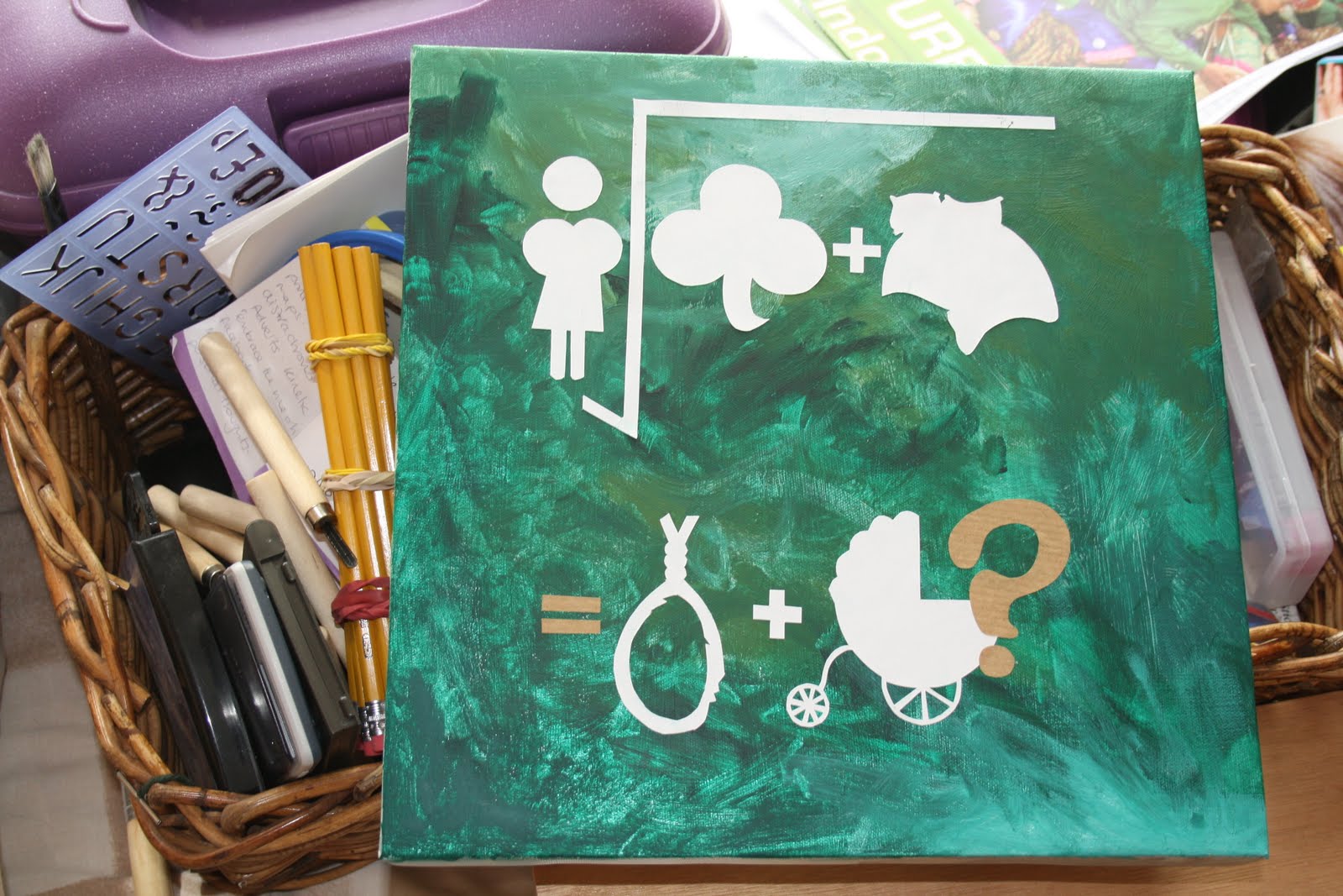
Here is a rough off my 8x8 junctures design. We have teamed up with the creative writing students of Manchester Metropolitan University to illustrate their work. In a nutshell, the story I have been allocated ('Junctures') is about the infidelity of a woman who subsequently has a child but does not know who is the father. Rather than trying to illustrate the emotions that the story deals with, I have chosen the illustrate the key elements within the text and make an equation. I liked this idea as there could be a variety of different outcomes, just as the word 'juncture' suggests.

It needs a little more work, the white elements need a little 'something' to give them more character, but at this stage am unsure of what. I like the composition and the background, I think that the background in particular illustrates the authors own ideas well (a mixture of Finland and Yorkshire). Yellow is referred to a lot in the story and the author suggested that it is a story of dark and light. My idea was to possibly use the yellow as light and black for the dark aspects such as the noose. I will of course incorporate stitch towards the finished result.