Tuesday 29 March 2011

Jessica Horrocks 3

Here is some feedback that Jessica Horrocks gave me on my finished editorial piece:

Hi Chloe,

This looks cool! I like the stitching and handmade textures. The only thing I would suggest is perhaps lightening the background a little so that the cat stands out more and contrasts with the background, because it's a really nice element :)


On 26/03/2011, at 7:00 PM, Chloe Jones wrote:

Hi Jessica!

I have attached a copy of the work that I am currently working on in response to a coffee magazine article. The coffee is called Kopi Luwak and the idea is that there is a cat in Indonesia (where the coffee comes from) who eats coffee berries, these pass through the cats digestive system and out of its anus and these are then washed, dried and made into coffee beans which sells at £50 per cup.
I wanted to incorporate Indonesia themed colours and patterns and also the idea that 2+2=5 as you wouldn't expect this to come through a cat.
If you could possibly spare the time to offer some feedback it would be greatly appreciated. Thank you again for your kind responses :)

Chloe

Saturday 26 March 2011

Kopi Luwak


Here is the canvas that I have been working on over the last few days in response to the Kopi Luwak article that I am briefed to illustrate

Rudy Gutierrez

To chloejones2@live.co.uk
Attachments, pictures and links in this message have been blocked for your safety.
Hi Chloe,
Thanks for checking out my work!
Where are you studying? Can you send me a link to see your work or
some jpgs?

1- I do use white but it is not always as prevalent because of the
high saturated color that I have tended to use. White tends to make a
color chalky and more pastel oriented which wouldn't work as much for
the intensity that I have been going for.

2- I like to create kaleidoscopic pieces where there is a clear point
and then elaboration on that point. i love the idea of improvisation
on some of these pieces combined with a solid idea and then having
fun seeing where it goes. Then it become about controlling the
imagery with pushing and pulling element so that they don't obscure
the idea but reinforce it. Sometimes it works and sometimes I have
failed at it! However, there are many pieces where I want simple hard
hitting simplicity or subtlety as well.

3- I don't have a set way of working. Somteimes it is dark to light
and the opposite. In She Plays with the Darkness it was about
capturing the mood and drama of a particular story that this painting
was done for. It was a book cover. The story was about a woman who
dance with rock paintings in a cave that came to life. Magical and
moody.

4- I see art as an extension of who I am and illustration is an
outlet that allows me to reach big numbers of people. Having said
that I would say that everyday life, my loves and hates inspire what
I do. I am very influenced by many artists, everyday lives and music
has always been a big inspiration.
I feel that as an artist with a "gift" I have a responsibility to
uplift and inspire others and to speak for those who maybe cannot.
there really isn't any blogs that I follow but I do think that it is
important to constantly feed yourself by reading, watching movies,
listening to music that speaks to you and generally choosing to view
listen and watch things that will feed you in a way that will inform
you and your art.

Much light to you and your art,
Rudy


On Mar 22, 2011, at 10:51 AM, webmaster@altpick.com wrote:

> This is an e-mail sent from a user of the AltPick.com web site:
>
> Sent from the altpick*com web page at:
> http://altpick.com/rudygutierrez
>
> -----
> User's Name: Chloe Jones
> User's E-mail: chloejones2@live.co.uk
> User's Telephone:
> -----
> This User's Message:
>
> Hi Rudy!
> I've been looking at your
> work recently for
> inspiration on an
> Indonesian themed
> project. The colours that
> you use are striking and
> fit well with what I'm
> doing. I'm currently
> studying in my second
> year towards my
> illustration degree and
> wondered if you could
> help me with a few points
> please?
>
> 1. You don't seem use a
> lot of white, is there any
> reason for this?
> 2. You don't seem to give
> yourself any space at all,
> the images are always
> really loaded, is there any
> particular reason why?
> 3. Do you work from a
> dark background to light
> or from a light
> background to dark? For
> example on 'She plays
> with the darkness' the
> background is particularly
> dark. Is there any reasons
> why?
> 4. What influences your
> work and are there any
> blogs you follow etc?
>
> Thanks very much for
> your time, if you have the
> time to reply it would be
> greatly appreciated, I
> understand that you are
> probably extremely busy.
> Thanks again
>
> Kind Regards
>
> Chloe
> - - - -
As from Katharine Asher, never be satisfied

I liked this piece of advice, it spurs me on to continue developing ideas and themes. If the deadline is 1 day or 1 month, use the time to its full potential, do not sit back and put your feet up!

Katharine Asher

To chloejones2@live.co.uk
For your information We've added this sender to your safe list. That way you can always see what they've sent you.
Dear Chloe:

Please refer to my own site
if you go to Figurative ..TRADITIONAL
you will see my earlier work which was far more 'loaded'/ realistic.
I much prefer the spontanaeity that water colour gives me .... and I continually evolve my style to stop me getting bored and to keep in lines with trends.
Watercolour ...I use both tubes and blocks - W&N is my preference
What medium I use depends on the job, and the effect I require.
My advice is
  • Never stop life drawing
  • Never be satisfied with what you are doing
  • Revisit your childhood and 'play' with different mediums
good luck K
To howdy@illustrationweb.com
Howdy Katharine!

I'm currently studying towards my illustration degree in my second yea. I have been looking at your work recently as I struggle with representing the figure. The way that you can manipulate the shape to do with it what you want/need is fantastic! I work similarly in that I have a lot of white space and use a minimalist approach. I was wondering if you could spare a few minutes to help me with a few points please?

1. Is there any reason that you work with a lot of white space? Are you scared of overloading your image etc.?

2. You work with watercolour a lot, is this your preferred media? Is there any reason why?

3. Your images are very fluid and suggest movement, do you ever work without this quality?

4. Do you work with watercolours from a palette or from tubes? Is there any easier option for you?

5. Do you always work so minimal? Do you have any images hwere they are completely overloaded?

Thanks for your time, I appreciate that you must be extremely busy. If you could manage to respond it would be greatly appreciated and help me towards my studies.

Keep up the fab work) :)

Kind Regards

Chloe

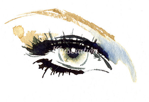
I like the fluidity of Katharine's work. The use of watercolour gives a great sense of movement, which my work does lack. I am drawn the Katharine's work because similarly to me she uses a lot of white space with minimal work. Also, I have a tendency to add eyes to everything I do to turn them into cute characters.
I like the piece of advice where she says not to ever be satisfied with anything that you do. Keep on developing and churning out work to find its true potential.

Friday 25 March 2011

Jessica Horrocks 2

Yes please I'd love to see! Send something over for sure.

I've always struggled with finding my style, too. Or with sticking to a style! I'm not there yet, though I always tend to gravitate back towards graphite drawings, watercolour washes and pattern. Hmm. Cool, I've traveled briefly through the UK but mainly stayed in London and with some relatives in Buckinghamshire. Never been to Liverpool!

All the best,
Jess


On 24/03/2011, at 4:03 PM, Chloe Jones wrote:

Hi Jessica,

Thank you so much for your prompt response you have helped loads! (",)

I study at Stockport college through Liverpool John Moore's University. I love my course, I'm into everything at the moment and I struggling to find 'me' and my style I seem to be drawn towards more of a collage method, but will dabble in anything. When I'm next in I'll send you something over if you're interested

Thanks again muchly appreciated

Chloe

Thursday 24 March 2011

Hi Chloe :)

Thank you for your email. I'm flattered that you're looking at my work for inspiration! Here's my answers to your questions:

1. You seem to construct your work manually, is this a preferred method for you? If so why?

Yes. It just feels more natural and comfortable for me to work with "traditional" mediums like pencils and paper, rather than digital mediums. I feel like I have more control, confidence and freedom with pencils rather than with a mouse or a drawing tablet. I majored in graphic design before I switched to illustration, and I had been spending SO much time on my computer that when I got the opportunity to focus solely on illustrating I felt a need to get away from the monitor. I often end up scanning drawings and playing with them digitally, to make patterns or more images. Overall, I think a combination of both "traditional" and digital techniques work the best for me right now.

2. Is there any reason why you like to use flora and fauna in your work?
I think it's all the intriguing details and room for creative license. It's definitely more of an aesthetic thing, though often a symbolic or metaphoric meaning will emerge later.


3. Where do you get your inspiration from? Do you trawl through blogs or are there significant artists you like?
Scientific illustrations always inspire me, and they're pretty easy to come by. The ones I find are mostly anonymous since they all fit into such a specific genre, though I'd like to investigate specific artists and their different styles more. Bookstores and vinyl/CD shops usually offer a plethora of inspiring graphics and illustrations for me. I like the tactility of handling illustrations/graphics in print, rather than just viewing them digitally.

4. Do you move about a lot, or are you quite a static illustrator? Does this impact your work any?
Quite static. I find that I have to feel comfortable in a space before I can make something I'm truly happy with. I suppose this impacts my work in that it allows for planning and careful time-consuming detail. My work isn't very spontaneous. I think if I moved about a lot it could possibly take on a more unpredictable, unrestrained quality.

Ok, well that's all. So where do you study? Are you enjoying your course? What kind of work do you make? I'm always interested in seeing the work of others!

Jess :)

On 22/03/2011, at 11:37 PM, Chloe Jones wrote:

Hi Jessica!

I have been looking at your work recently for inspiration on an Indonesian themed project. I like the delicacy of your lines and characters, I was just wondering if you could help me with a few points. I am currently studying in my second year towards an illustration degree and was wondering:

1. You seem to construct your work manually, is this a preferred method for you? If so why?

2. Is there any reason why you like to use flora and fauna in your work?

3. Where do you get your inspiration from? Do you trawl through blogs or are there significant artists you like?

4. Do you move about a lot, or are you quite a static illustrator? Does this impact your work any?

Thanks very much for your time, I understand that you are probably extremely busy, your time is much appreciated. I look forward to your response

Kind Regards

Chloe

In the black and pink image, Jessica uses collage but in a very subtle way. I like the way that her choice of newsprint comes through the artwork but it is not the central point. Jessica tends to use more illustrator collage than actual manual collage which I tend to work with.

Wednesday 23 March 2011

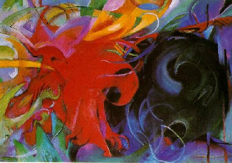
As I was struggling for Indonesian reference in terms of art/artists either currently or historically practicing, Peter pointed me in the direction of German Expressionist work. Although not Indonesian in origin, the colour is definitely linked. I have particularly been looking at Franz Marc whose work I really like. I think that expressionist work will relate to the work that I am producing well as I am trying to give the mood of coffee in my backgrounds. When doing an Athens search, I have also found that historically, Indonesian art (although I can't find any) was created on water buffalo hide and a prominent piece of architecture is the Borobudur. Also, Stupa architecture appears frequently as does batik.
This is a Franz Marc piece as has been created with chalk/pastel. This is interesting for me as I need to start adding these materials to my background to add the effect that Rudy (as seen in earlier posts) has achieved.


Tuesday 22 March 2011


For my Indonesian inspired project I have been looking at Rudy Gutierrez who uses particularly striking colours which fit with my brief. I have contacted the fine artist/illustrator to see if he has any hints and tips as I was interested whether he works from a dark background and lightens it up with paint or whether he starts on a light background and works to make it darker. This is an important tool for me as I am trying to replicate this for my backgrounds. Here is a copy of what I have sent to him:

Hi Rudy!
I've been looking at your work recently for inspiration on an Indonesian themed project. The colours that you use are striking and fit well with what I'm doing. I'm currently studying in my second year towards my illustration degree and wondered if you could help me with a few points please?

1. You don't seem use a lot of white, is there any reason for this?

2. You don't seem to give yourself any space at all, the images are always really loaded, is there any particular reason why?

3. Do you work from a dark background to light or from a light background to dark? For example on 'She plays with the darkness' the background is particularly dark. Is there any reasons why?

4. What influences your work and are there any blogs you follow etc?

Thanks very much for your time, if you have the time to reply it would be greatly appreciated, I understand that you are probably extremely busy. Thanks again

Kind Regards

Chloe

The pattern on this image reflects the patterns that I have been generating with reference to Indonesia.


Here are a few attempts of my Indonesian inspired backgrounds. I love the effect and the colours, however the white shows through from the paper underneath. As a development I will now try to do the same on dark paper or a paper already with a darker wash on it. Additionally, I will try to add some chalk/pastel to give the background more depth.

Tuesday 15 March 2011

Indonesia Research

For the first of our editorial briefs, I have chosen a magazine article from GQ about Kopi Luwak coffee. The idea is that civet cats from Indonesia feed on coffee berries, which pass through their digestive system and out of their anus. This is then washed and dried to make coffee at a whopping £50 per cup (can be sourced at Selfridges if you really are desperate to try this delicacy!) For this article I have started to brain storm ideas and look at research to inspire me and give me more insight into Indonesia.
With Indonesia being in the Far East, it seems to be pretty heavily influenced by oriental design. The colours are fantastic and am looking forward to incorporating them in my work. Indonesian shadow puppets appear to have significant value in their culture and are very intricately crafted. Paper cutting is not something that I have dabbled with before and so could be one direction for my next project to venture into.
Colours tend to be orange, terra-cotta, red and yellow, as can be seen in the images above. I like the use of black and the shadows are very precise, obviously the lighting in Indonesia will be much brighter and warmer than here in the UK!
I didn't have the idea of creating a civet cat puppet initially, although I won't disregard the idea completely at this early stage. It may be worthwhile gathering ALL of my ideas together and presenting them to see which has most mileage to carry forward. This is a lesson that I learned quickly in the last project as I found I tend to chop and change from one idea to the next and losing time and effort along the way. This time I am putting structures in place so that this does not happen. I am listing ALL of my ideas to begin with and then choosing one and sticking to it.
I had one idea of showing a cat metaphorically having flowers and butterflies and elements of luxury and prettiness coming from its rear end. I really like this idea and there is plenty of scope to play around with different elements and do so fittingly in an Indonesian style. Whilst researching butterflies on a simple Google search, I stumbled upon Cissy Cook. Her work does vary from mine. It is very pretty and has elements of beauty whereas I tend to have characters appearing all over the place. However, she does deal with white space in a similar way...
The idea of mixing collage with hand crafted things such as these delightful butterflies appeals to me. She deals with bright colours well which I will need to do for this project to convey that Indonesian origin. I also like the white frame, I think it looks expensive highlighting the hard work and effort that has gone into creating the work and worthy of a gallery space.

Isidro Ferrer

I was inspired in the last project (Wellspring) by Isidro Ferrrer, who Ian introduced me to. I have added some of his most inspiring works, I think that these work so well due to his vintage finds. Rather than using elements which are already loaded with meaning, he chooses older items which have lost their meaning to a modern audience. This is seen similarly in Eduardo Recife's work (seen earlier). To make my work more successful I need to source these older elements rather than working with Kellogg's cornflake boxes which look like a child has been playing with them.
Also, he draws into his photographs too, giving them more intrigue and make them more aesthetically interesting.


Thursday 10 March 2011

Eduardo Recife

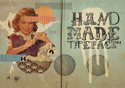
I have been looking at hand rendered types recently as I seem to be very interested in this area. I have stumbled upon Eduardo Recife when doing a basic Google search. He is a Brazilian illustrator who founded Misprinted type. On this website he has several different types all hand rendered and all as beautiful as each other. I have emailed him today with a few questions to help my learning further, I do so hope he responds!
I think the way that he layers his work is fascinating and is definitely a method that I would like to try myself in up coming projects. I do work with collage normally, I think that I just need to be more selective with the media that I use rather than just picking anything out. Also, Recife uses 'older' media, which therefore has less understanding to it. For example, I use magazine cuttings a lot but because they are current they are so loaded with meaning already that when you look at it, you do not look at it for what I have created but for what it already stands for. By choosing older media, that loaded message no longer exists.
The composition of both these images is obviously laboured over. Both are balanced but not symmetrical, which tends to be a trait in my personal work.

Monday 7 March 2011


This morning I have finally created my final outcome for the Wellspring project. After a slow start I have ended up with an image and layout that I am happy with. I have decided to place the image in the bottom right corner to draw intrigue and interest from the audience and not follow standard constraints as the newspaper would be boring and samey.
Indeed, the image does look much better in colour but this is one of the requirements of the client. I am hoping that not a lot o work will have this stipulation. Although it wasn't difficult to greyscale the work from a full colour version, the colour just adds a certain quality that black and white cannot capture.
I love the character that I have created out of a sponge, plug and banana. The overall message was to juxtapose elements that do not usually appear together to intrigue my audience as to why they are seen together. Also, because it is quite small, not using the whole of the a3 space, it would draw people to look into it in more detail.

Sunday 6 March 2011


I have been looking around at type. I seem to have a fascination for hand rendered type, with it's organic quality. Above are a couple of mine I have produced over the last few days for the Wellspring project. I liked cutting into papers to create shadow on my type as well as hand stitching which can be seen in the last project. I must say that I don't like the idea of doing my type on a sewing machine, it's the mess at the back that is my favourite part!